Case study
Clarins
The cool project
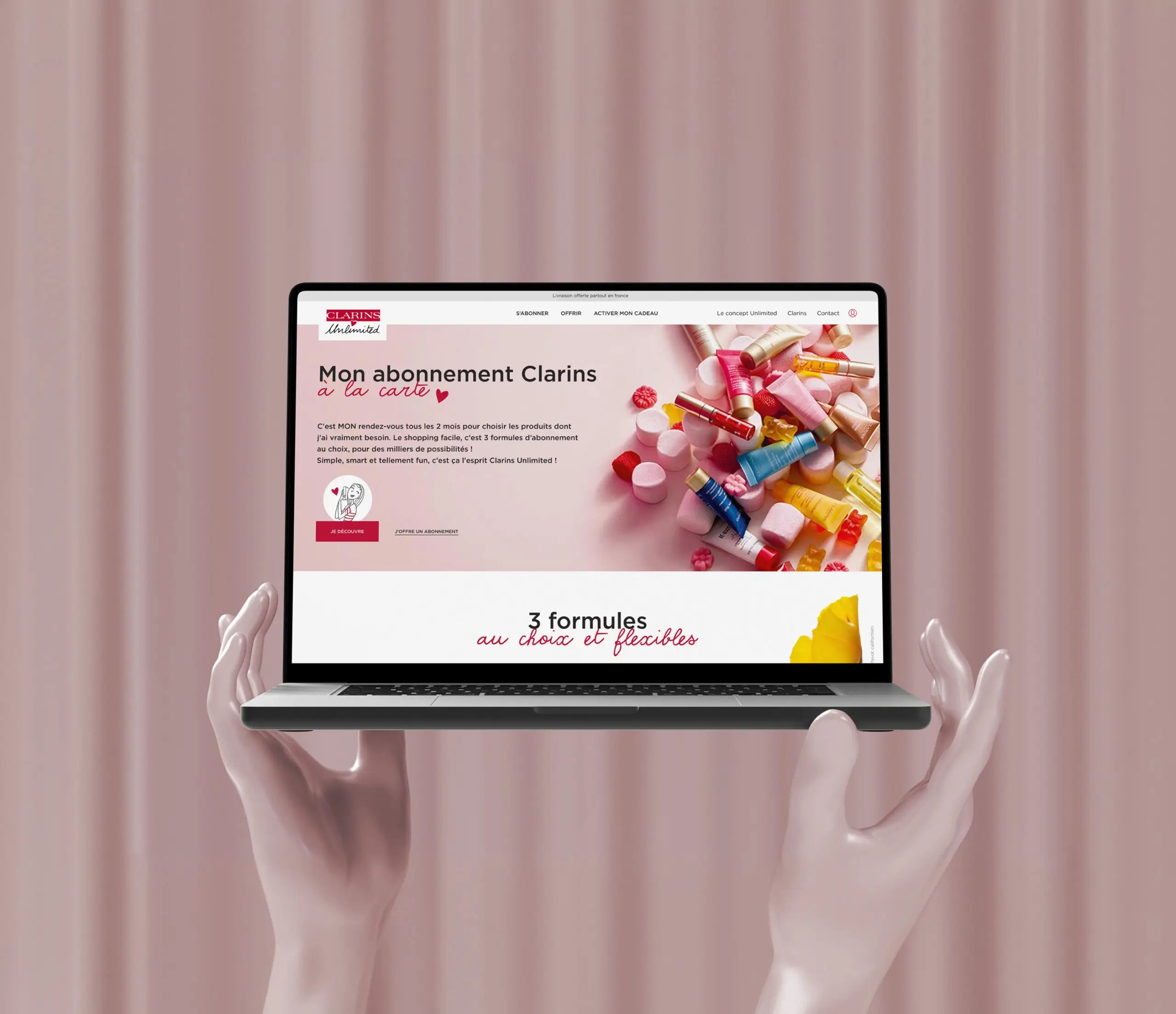
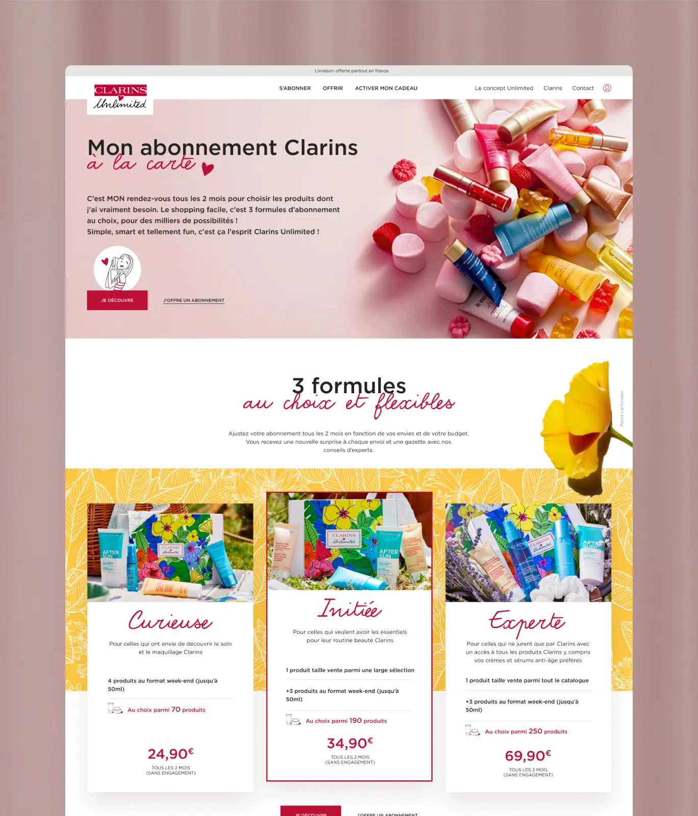
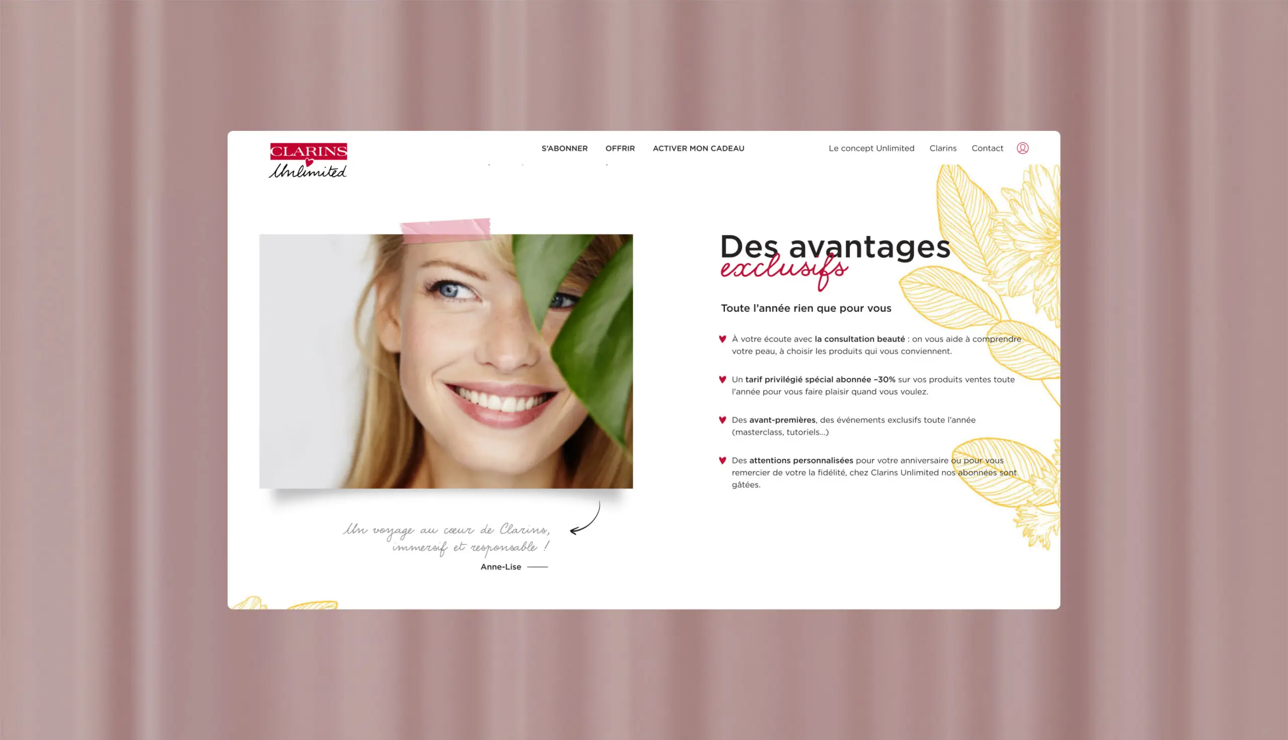
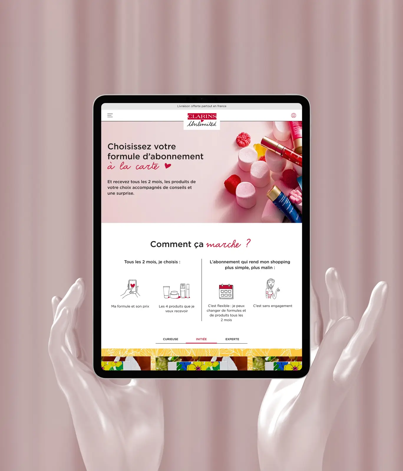
Clarins Unlimited offers a subscription service to a box of Clarins products with expert advice and discounts on the boutique.
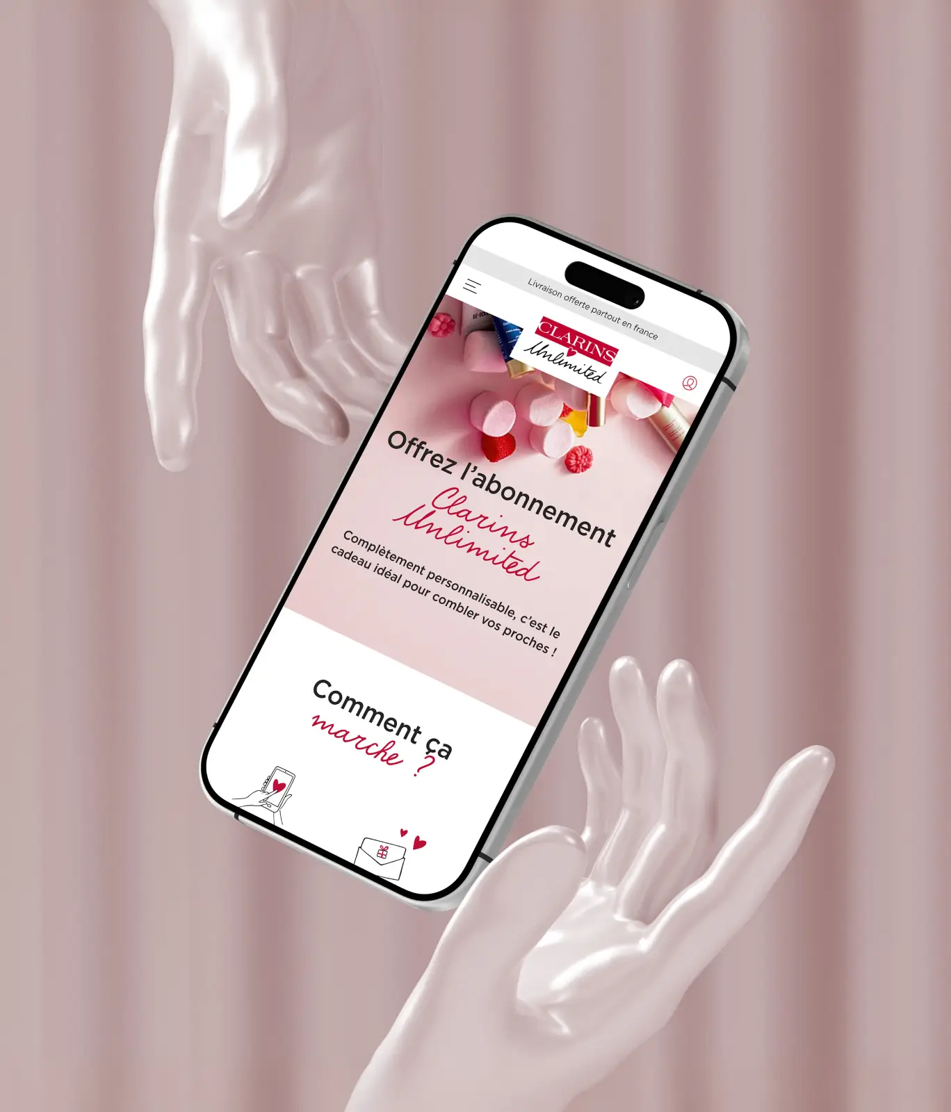
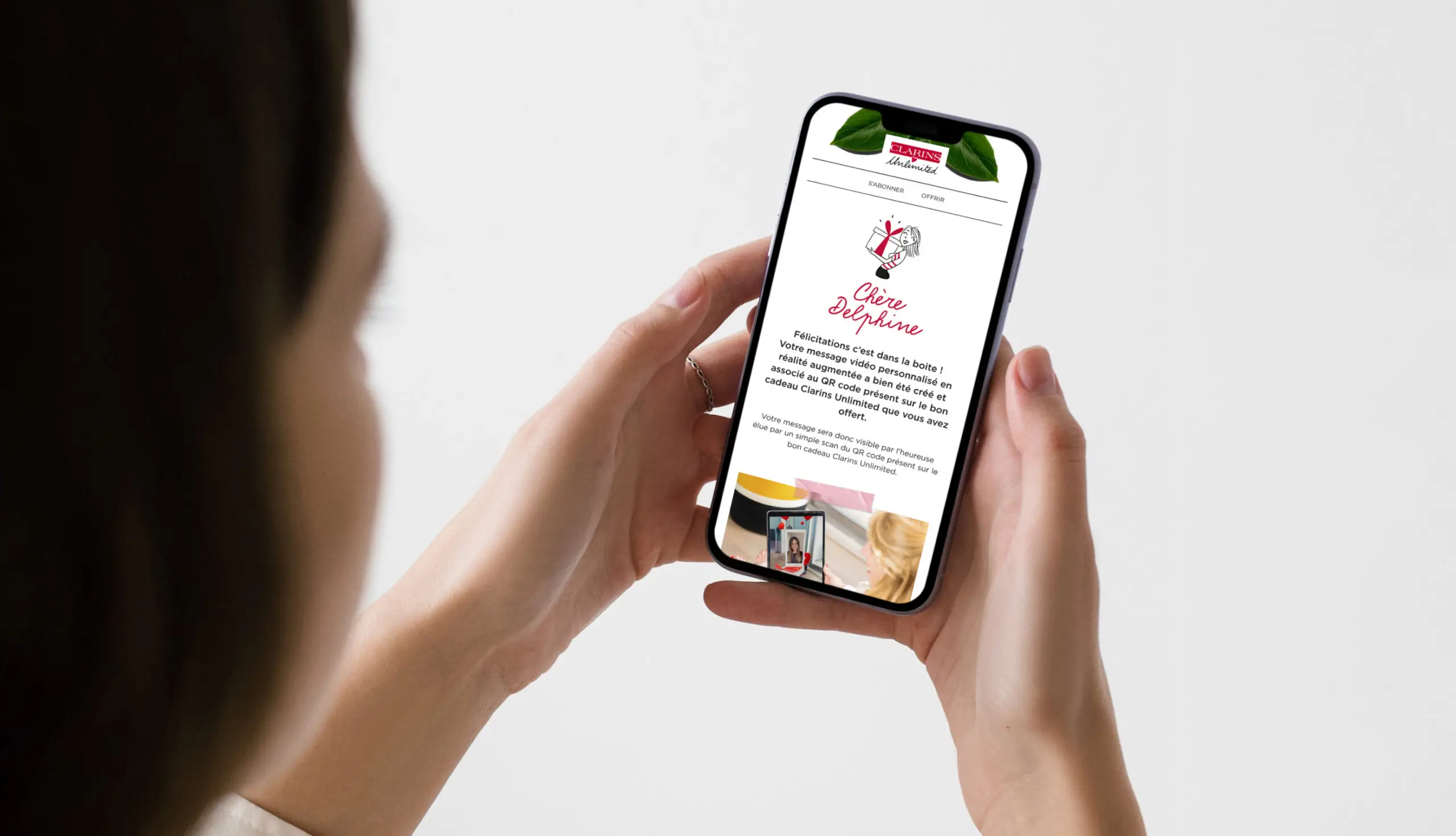
We delivered a comprehensive website revamp, refining the presentation of their updated offer. We redesigned all landing pages and automated emails, boosting user engagement and streamlining the purchasing process. Additionally, we focused on mobile accessibility to address the significant rise in mobile site traffic.
Scope
- ux
- design
Tech Stack
- -
Client
Clarins
Credits
- DigitalProd
- Galadrim
